CSS3 is great at animating web content. While developing the electrum-arc
collection of web components, Daniel Roux started to experiment with some
simple CSS transitions, in order to provide a smooth transition between
display states of active elements (e.g. normal → hover →
normal for a button).
There are many excellent resources on the web for those who start playing with CSS transitions and animations (let me point you to Shay Howe’s excellent introduction to transitions and animations and Val Head’s book CSS animations pocket guide published by Five Simple Steps).
Basic example of a button transition
Let’s have a look at a simple transition effect applied to animate the
background color property of a <div class="box"> element:
 1.box {
 2  background: #22bb33; // dark green
 3  transition-property: background;
 4  transition-duration: 2s;
 5  transition-timing-function: ease-out;
 6}
 7
 8.box:hover {
 9  background: #88ff99; // light green
10}
Whenever the mouse enters the element, the color progressively changes from dark green to light green. The whole transition takes 2 seconds. And when the mouse leaves the element, the color returns to dark green, again using the same transition parameters (also 2 seconds).
But what if we want a quick animation when the mouse enters, and a slow fading animation when the mouse exists the button?
Asymetric transitions
I first thought of using some JavaScript to listen for the focus and
blur events and changing the transition properties on the fly, by
code. But this is not elegant, and CSS3 provides a better way to do
exactly this without a single line of code.
Let’s recap what the example above tells the browser’s rendering engine to do:
- When applying the
.boxstyle, use dark green and transition the color in 2 seconds, using the ease out timing function. - When applying the
.box:hoverstyle, use light green and inherit all other properties from.box.
So .box:hoverincludes the properties for transitioning the color in
2 seconds, using the ease out timing function.
Whenever the mouse enters the button, the .box:hover style gets active
immediately, and the properties get transitioned according to what
has been defined by the transition-... properties.
So, if we change .box:hover to include its own transition-duration
to, say, 0.1s we will see a very quick transition when .box:hover
becomes active. And the slow, 2 second transition when returing to
the .box style.
Source code
And here is the source of an example which shows a quick transition from normal → hover and a slow transition back from hover → normal.
CSS
 1.box {
 2  background: #22bb33;
 3  border-radius: 8px;
 4  cursor: pointer;
 5  height: 80px;
 6  line-height: 80px;
 7  text-align: center;
 8  transition-property: background;
 9  transition-duration: 2s;
10  transition-timing-function: ease-out;
11  width: 80px;
12  margin-right: 20px;
13}
14
15.box:hover {
16  background: #88ff99;
17  transition-property: background;
18  transition-duration: .1s;
19  transition-timing-function: ease-out;
20}
21
22.container {
23  display: flex;
24}
HTML
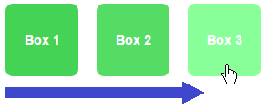
1<body>
2  <div class="container">
3    <div class="box">Box 1</div>
4    <div class="box">Box 2</div>
5    <div class="box">Box 3</div>
6  </div>
7</body>