We’ve been discussing various ways to build a UI where the display
is split into two <div>s. One has a fixed width, the other should
occupy 100% of the remaining horizontal space. If the browser window
gets too narrow, a scrollbar should appear on the flexible element.
One solution would be to set the widths explicitly:
width: 300pxon the first elementwidth: calc(100%-300px)on the second element
I did not like the idea, since this requires that the second element
needs to know how wide the first element is, in order to write the
calc() property (i.e. 300 pixels). I’d rather have the browser
figure this out for me:
Here is the solution I’ve come up with:
1<!DOCTYPE html>
2<html>
3 <head>
4 </head>
5 <body style="margin: 0;
6 font-family: 'Open Sans', Arial, sans-serif;
7 font-size: 14px; line-height: 1.5;" >
8 <div id="root"
9 style="display: flex; flex-direction: row;
10 height: 100vh; background-color: cyan">
11
12 <div id="panel"
13 style="flex-basis: 100px; flex-grow: 0; flex-shrink: 0;
14 background-color: gold;">
15 </div>
16
17 <div id="surface"
18 style="flex-grow: 1; flex-shrink: 1;
19 overflow-x: auto;
20 display: flex; flex-direction: row;
21 margin: 10px; background-color: cornflowerblue;">
22
23 <div id="view"
24 style="min-width: 200px;
25 margin: 10px; background-color: white;">
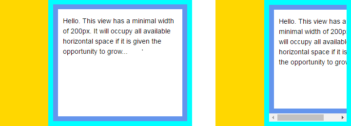
26 <p style="padding-left: 10px; padding-right: 10px;">
27 Hello. This view has a minimal width of 200px. It will occupy all available
28 horizontal space if it is given the opportunity to grow...
29 </p>
30 </div>
31 </div>
32 </div>
33 </body>
34</html>
Explanation
A root specifies that its children should be laid out using the
flex model,
displaying both inner <div> side by side:
- The left panel sets its width using
flex-basis: 100pxand explicitly disables any growing or shrinking, making it fixed width. - The right surface does not set its width; it also specifies
that it may both grow and shrink. The
overflow-x: autoensures that a horizontal scrollbar will be added if the content no longer fits in the available space.
The surface contains an element which may not become too narrow. Its minimal width has been set to 200px. As soon as the surface gets below 210px (minimum width + left margin of view) a scrollbar appears.